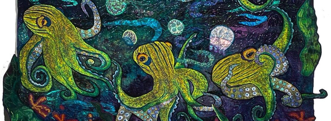
For those of us who use bobbin work, there is always the quest for empty bobbins. For every color of thread I use, I need a bobbin with that color of thread.
So it’s no surprise when I get a new kind of machine, I usually buy 200 new bobbins for the machine.
Unfortunately, bobbins cost more. My Bernina 770 uses a $5 bobbin. They are pricy. But truly, like being too rich or too thin, there are never enough.
Thread is pricey too. It won’t go back on the spool. So you either use it up or pull it off the bobbin and waste it.
So when I went to do a run of minnows, I looked at my bobbin box and made a plan.
I didn’t want the fish to be in any way identical. That’s not the nature of nature. Nature is endlessly variable. So I decided on green fish and yellow fish, and planned to empty each yellow or green bobbin dark to light, top to bottom.
The fish I’d drawn had cross hatched details. I lined up my bobbin colors and made a progression of colors square by square, dark to light. I think I filled 4 bobbins for the whole batch. How many did I empty? The empty bobbin count at the end was 16.
Here’s the finished fish. Because I wasn’t micromanaging the colors, they clash a little and contrast not only in color but in tempurature. Which makes them shimmer a bit. Like fish.
My dad would have been pleased to make that catch. And I have enough empty bobbins to tackle the birds next.
My mother made sure I had a pink bedroom as a girl. But being herself and a sophisticat, she made it brown and that orangy pink that only the fifties could love. Between that and pink being a color for silly girls, I wrote pink off. Magenta, yes. Fuschia of course. But no baby pink ever!
When we were 5 my cousin Peggy and I decided that yellow was our enemy color. We would never wear yellow beause of that. We had a point. It didn’t flatter either of us. Yellow was the enemy.
Yellow is still unflattering, and I still won’t wear it. But I have come to a truce with it. The truth is, you can’t just cut yourself off from a color as an artist.The world is full of colors and they all need each other no matter how you feel about them. You need them all. Which brings me to my other enemy color, pink.
Except that you really can’t do that. Sooner or later there will be a reason for every color. And you’ll need it in your crayon box.
I could have never used pink if I hadn’t found roseated spoonbills.
I’ve been in love with dinosaurs all my life. When paleantologists started talking about birds coming directly in line from dinosaurs, I went on a bird binge. Particularly the big water birds that clearly are dinosaurs. I’m still there. I loved there odd legs and wings and bills.
I’d worked with herons before. And I still love them. But the roseated spoonbills were unabashedly pink. And clearly dinosaurs. They turned my world upside down enough to use baby pink.
Pink or not, I couldn’t help myself. Maybe it’s the bill. Or the long stalky legs. Or the idea that something very old is still marvelous and wonderful, and part of our world. I can relate.
If it makes something that wonderful I’ll use baby pink and coral pink, seashell pink, flesh pink. For a roseated spoonbill, anything.
Do you have a color you just don’t like? Be brave. Embrace it. It maybe the only thing that makes what you want come to life. Mix it in with other things and watch it show you where it’s place in the world is.
We’ve talked alot about progressive color. Any image with a flat color scheme is going to be just that. Flat. Shading creates a top and a bottom, a sense of where something is in space and dimensionality. There are a million ways to shade. Shading is about value. it’s also about creating a dimensional image. Shading makes things round. Which helps them look real, even if the color is a bit wonky. But it can be managed many ways. Here are some of the ways I build color schemes.
as a series of the same color
a base color with a shocker and shader, say, orange. warm yellow, yellow. cool yellow, with purple and green (see Shockers and Shaders)
Almost always, I’m using progressive color. You can see the colors line up from dark to light to create shadows and space.
We’ve also talked about over stitching, edge stitching. I usually do a final stitch over in black, just to clean up the edge from rough stitching. See Hard Edge Applique: Defining the Line.
These birds are by their nature outlined, feather by feather. Not just with black but a bright outline as well.’
One of the basic color rules is that your background defines the light of the piece. If tyour images are in an orange light, then the outlines are orange. So I shaded the outlines as well as the basic shaded background. Do I have that many shades of orange thread? Of course I do!
Shading the orange outline as well as the birds helps establish their round plump little selves.
Next week I’ll share what happened when I tried to do a reflexion of the birds in their pond.
I’ve been working on this quilt for some while, and it’s gone through several transformations. We had a mocking bird in here which is now slated for a later flight, somewhere else. And we’ve added lizards and subtracted lizards. All the way through, it’s been a stumbly path.
But each quilt needs to build a path for your eye. It’s more obvious with elongated quilts, but if you want movement in your work, you need to help the eye move.
What makes your eye move? Usually the small things: rocks, bugs, a strand of yarn over the piece, leaves. In this case, it’s bugs and owls. What makes the owls seem to move? The turn of their heads. What makes the owls heads move? What they’re looking at, of course.
It helps that the owls are darling. I’ve been in love with them since I stitched them in. But I found the path of the whole piece depended on what they were looking at.
It’s not an exact science, but we look where the owls are looking. It all turns on the turn of the heads.
I talk alot about color theory, choosing of threads and creating color schemes. The nature of thread painting is no different than any other art. It’s a creating of colors from components. How you arrange those components changes the effect you get.
I usually line up colors light to dark and add in a shocker and a shader. That color scheme gives us a smooth layer of color that builds on itself. It’s pretty. But it hasn’t got a whole lot of depth.
Sometimes I separate the the scales into a dark and light zone. That creates a deep separation on the scales without any shading. That’s pretty too.
I wanted something different for this fish. I wanted the scales deeply separated and clear. So I underpainted my fish first in blues, purples and greens, and then over painting with yellows and oranges.
Is it extra work? Yep. Would I do it all the time? Probably not.
But one of the wonders of doing Koi is their textures. The textures of fins and scales and their sense of motion is all of that.
So I started underpainting with the complements of the piece. Since the fish is yellow orange, the underpainting should be blue. green and purple.
He’d be pretty if I just continued in that range. Instead, after establishing the darker underpainting, I painted over with yellow and orange threads.
After that, I added a light layer of turquoise metallic thread for flash and black outline for definition.
This is where I think I’m going with this. The underpainting separates and lifts each scale and the outlining nd flash stitching punches it visually.
If you are keeping score of colors on the color wheel, you’ll notice it has a full range of analogous colors from Yellow, green, purple to blue.
Is one method better. Heavens, no! It’s a matter of having choices and knowing what those choises offer you. Now I’m off to stitch rocks and hostas.
What do these two quilts have in common? Not that much. They’re a different shape. They’re a different color space. They’re a different time of day. They’re clearly both heavily embroidered and oil paint rubbed. But other than that?
They both needed small elements to guide the visual path within. I made all the bugs for White Garden. But I didn’t need them all. The others went into Fire Flies.
Large embroideries take time. I draw them, look at them with some scruteny and eventually embroider them after I’m sure they’re right. It takes time. And effort. Usually a larger embroidery takes about a week to a month. They are a long term investment in time and energy.
If I’ve drawn them well, they should have energy and movement within them. But a good moving image needs to be placed in motion. One easy way to create movement is by the stepping stones of smaller elements. I often use rocks, bugs, butterflies, frogs, flowers and other natural images to help direct that path.
So it stands to reason, I need a lot of those. I do make batches of them for specific projects. But I always make way more than that one project needs. I used to stitch them directly into the quilt. I’ve changed to stitching them separately because it allows me much more flexability.
Why? It’s time effective. I don’t need to set up the thread, redraw the cartoons, and go through just enough flowers or bugs. A batch of them, with leftovers is as good as extra waffles the day after you made them. It’s just smart.
It’s also fun to sit down to a sheet full of little fish or flowers. It’s a lovely 2 day project, usually.
Do I have a collection of these things? You betcha. But they go away fast. There’s always another quilt that needs a trail of bugs.
I’m worn out after doing a bunch of big pieces. Big is of course, relative. I consider anything past 33″ x 43″ largish. I like workin that size. But the last ones have stretched larger, and I’m tired of shoving large wads of fabric through the machine.
I’ve been working on a white garden piece. The idea came fromThe White Garden, a speculative fiction about Virginia Wolf. She was thinking about an all white garden for the blackout, so that the moon would show on the white petals. I found some embossing plates that were wonderful prarie grasses. I put them on dark blue hand dye in shades of white and blue.
I’ve never had the dicipline to plant only white flowers. Too much of a color junkie. But I love the idea.
This is a visual path piece. It’s about 12″ x 45″ So everything has to be tiny.
So I made a strip of white and pale flowers. But then it needed moonlight and bugs. No one said the bugs had to be white.
How is tiny embroidery different than large pieces. Several things work differently. First off, I want to avoid a thick outline. So instead of embroidering on a sandwich of hand-dye, felt, stitch and tear, and totally stable, I left out the hand dye, and embroidered on the felt instead. Since I wqs using black outlines, I used black felt. Using felt reduces the bulk, but I found it could not be ripped out or sewn over. This is partially why I made a lot more bugs than I would need.
I could have embroidered tiny pieces within the piece. But I chose not to this time. It still makes for a lot of distortion. So I did a batch of moths, fireflies, snails and rocks.
Embroidering tiny pieces insists upon simplification. The usual shocker-shader colors are too much. A simple range works better: gold and green, white and blue, green and blue.
The fireflies are also mostly unshaded. There’s no room for anything except the primary colors of red and green.
So my white garden is full of wild color, very tiny bugs. I think I could find my way in it.
It’s been a tough week. I’m a machine down and my right knee isn’t working. So I’ve been working on that small blue and white moonlight piece with moths and fireflies. Which means lots of fireflies and tiny moths.
Sewing the body
But my week didn’t really top the charts. I have a friend having a triple bypass next week. I know she’s scared out of her mind. I also know I’m too far away to do very much. So I’m making her a Dammit Doll.
Her friend suggested I make clothes for her. It’s a nice thought, but I’m not really a sewer. And it will cost more than buying clothes. I told her friend that I had gone to the Omar the Tentmaker school of fashion design. My speciallty at moments like this is something silly.
Embroidering the face
I don’t care how much your doctors care, and how kind the staff is. Surgery sucks. Seriously. So there will inevitably be alot to be upset about. All that energy has to go somewhere. So you can take your Dammit Doll, wack it on any surface near by and speak the time honored chant: “Dammit, Dammit, Dammit.” Those of us with a more Shakesperian eduction may be able to elaborate on that.
Pearl cotton hair
It’s true. The feelings need to go somewhere. There’re not a lot of ways to express that in the hospital. It’s adrenaline from being surgically attacked and the inabilty to move for the same reason. It shakes down badly without a way to express it all.
I’d say I could use one myself, but it’s enough to make them. And they need silly hair which is half the fun. I’ve made two so that her caretaker can have one as well.
In the end you have to blame someone and there’s no one to blame. So it’s San Andrea’s fault and a place to dump all the anger, fear, and pain that goes with surgery. An act of serious silliness.
I was a teacher before I became a quilter. So I’ve never stopped being a teacher. It’s one thing to work out solutions as an artist. But it’s always seemed wrong to me that those solutions should be secret.
It’s back to what defines your art. If technique is what defines you, then you might want to hold on to your technical secrets. A special way to do applique, or bind a quilt or dye fabric will define your work.
Dacning in the Light
But that’s never happened between myself and my students. I’ve always tried to pour out information for them to use in any way that helps. For all of the thousands of women I’ve taught, no one has tried to take my style as their own. Instead, they’ve taken technique and used it for their own vision. That’s inevitable. And excellent. Who else would make a series of 6 foot praying mantises? It could be arguable that no one else needed to. They’ve had their own visions. What I’ve taught was nothing more or less than a tool kit.
Because that’s what art really is: vision made visable. What matters most, is can you manifest the things you see in your head. And how you do that. Tech is a tool kit. Usable, valuable but no end in itself.
The how changes regularly without warning. They stop making your favorite stabilizer. Or fusible. Almost everything needs to be reworked at this point.
But sometimes you just outgrow tech. I started on a quilt where the rocks I made looked stupid and childish and I had to change it. They needed shading and distinction, and that prompted me to change my technique.
The rocks I’ve been working on for two weeks just needed more than that approach. I suppose it was making a rock face for a waterfall. I put up simple rock shapes and was appalled.
For some while I’ve made rocks with simple hand dye, fused directly to the top, and stiched with freemotion stitchery with smoke monofilament. It kept the rock edge from being one solid color and the hand dye does echo the variations within rock surfaces. If you look up Sun, Clouds, Water and Rock: Making Elements with Soft Edge Applique, you can see my original thinking on it.
Why talk about it? Because I hate giving a recipe for a cake that won’t rise. Perhaps you might have learned to make rocks from me and are frustrated too. Perhaps you’re trying to resolve how to make rocks for your own work. Perhaps it might make better lizard skin. My point is we never know how other people use our techniques, but I beleive it to be unholy not to share.
So I worked on two kinds of stitching with the rock: zigzag stitcing to creaate shadow and shading, and straight stitching to define the grain of the rock and the top edge. Because it takes that extra amount of stitching, I made them on a layer of felt and tear away, so that any gathering gets cut off when I’m finished.
Stitching down those two kinds of edges takes two different kinds of thread. The bottom edge needs a tight zigzag stitch in black polyester. A straight stitch line defines the top of the rock edge. But the top edge needs soft edge zigzag stitch with monofilament, to maintain the grain edge of the rocks and stitch it solidly down.
It’s different thqn whqt I taught before, so I’m updating for you. If you ask me, I always will. I look forward to the rocks you might make in your journeys. And your vision which is your’s alone.