Seeing Spots: Some Strategies for Shading around Garnet Stitch

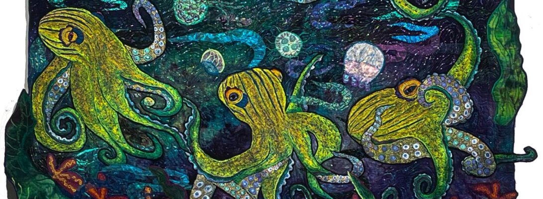
We worked with garnet stitch to do octopi several weeks ago. That was an all-over garnet stitch that could be shaded across the piece. But what if we want separate spots and smooth shading around them? How do we go about that?

What we need to do is to define the spot clearly, and then shade around it. But shading with one color around the spot negates a color range shade. We need to put in our spots and then shade around them defining different sides of the spot with different colors.

We start dark to light with the darkest threads first. The first color needs an outline stitch done at an angle to define the shape. Then we’ll shade out to the side, and then smooth the line between the outline and the shading.

But after that row, there’s more shading than outlining. When we come to each spot we outline the spot on that side and shade past the edges of it. Then in the next color row, we outline it from the other side and shade it into the earlier colors. The spot is clearly in the color range but it’s defined by the outline around it that fits the shading as it changes.

It’s a cool trick for including spots in a smooth range of colored stitchery.

For more information about shading colors check out The Long and the Short of It: Blending Stitches with the Long Stitch.

Cut Off the Same Cloth: Elements that Work for More than One Quilt

Years ago someone asked me how many mushrooms go in a quiche. I asked back, “How many mushrooms do you have?”

I don’t make copies of things. I do make variations, and I find it useful to rethink some things I’ve done before, or more importantly tried to do before. I might get lucky. You never know.

But there are some things I know I can always use. There are never enough dragonflies, daisies, frogs, or mushrooms. They make an excellent point of interest for a visual path through a piece. And every so often I make batches of them.

The last two quilts had lots of frog and mushroom action. But they are such different pieces. Why did that work? Why do the same color elements work in two really different color backgrounds?

I’ve thought about it a bit and have decided that bright is a color all of its own. Green Heron Hunting features a bright fall-red sky, a stream, and some rocks. High Rise Living is a soft-colored background as a garden with lobster claw plants dangling in the breeze. The backgrounds couldn’t be different. But both backgrounds are a strong contrast to the mushrooms and frogs. High Rise Living is almost pastel. Green Heron Hunting is a bit somber. Both of them are high-contrast against the backgrounds

Batching regular elements has changed my work a lot. I find I can do larger elements with much less distortion. The downside is they need to be stitched down afterward. The mushrooms get stitched down with the most prevalent color on the edge. The frogs and other elements usually get stitched down with black. I don’t always like the heavier black borders, but it eliminates a lot of pucker and distortion.

So I continue to make batches of the elements I know I’ll use again and again, Contrast, any contrast makes elements work together. And there’s always room for one more frog.

Reaching Upward: The Vertical Visual Path

You’ll remember in blog post Don’t Be Square, we introduced visual paths. Visual paths are a designed pathway through your quilt to guide the eye across the surface. A vertical visual path works differently than a horizontal one. Horizontal visual paths pull your eye across the width of your quilt.

A vertical visual path almost always draws your eyes up through the piece? Why? Largely because of the shape of the quilt and the fact that we usually follow things from the bottom up when we look at them. These dynamic dimensions already launch the viewers eyes up the quilt.

But good planning and design help as well. If we place similar objects along the pathway, the eye will also follow those, just like stepping stones. The flowers aren’t big, but the direct your eye through the piece effortlessly.

I favor ‘s’ shapes for the visual pathway. But other shapes work as well. Any direction that pulls the eye makes the whole surface of your work pop as your eye travels through. The squirrel himself makes the visual path here, and he’s traveling straight down. Either way, it makes the eye move.

Stems on the flowers, and the blooms themselves start the eye down to find the turtle. Whatever direction your path goes and whatever stepping stone you use, it makes the dynamics of your quilt work to show off every wonderful detail.

So don’t be square! Play with elongated shapes, and see where your visual path takes you!