What Rules? Testing Out Old Theories about guilding lilies

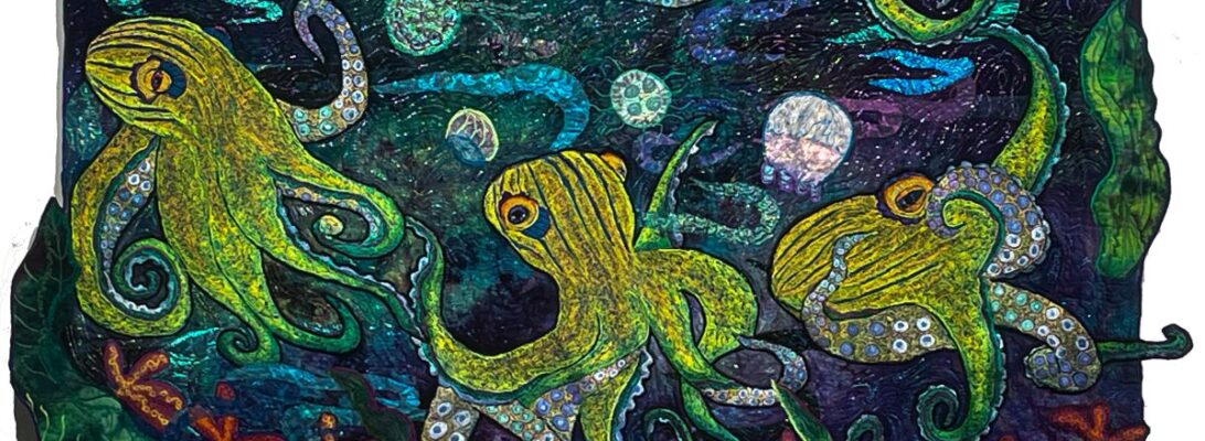
Swirling water, with metallic thread.

Whenever you teach, people want you to give you rules. Directions. Patterns. A safe way to get results.

That’s fair. That’s what they come to class for. What they’d really like is a formula. Add a plus b, divide by six and get your result. I do understand. And underneath it all, I have a list of odd rules as well.

But I do know that they’re odd. They’re based usually on experience. But sometimes they’re annoyingly limiting. And every so often, I test them out. I push the borders, just to see if it’s a superstition I’ve made for myself, or something really helpful. Or if the materials have changed.

This is a process I call gilding the lily. I take a really lovely print or rubbing and accentuate it with thread. I’ve taken to doing it a lot with oil paint stick rubbing.

One of the tricky things is working with metallic, of all sorts. Metallic goes with metallic, right? I used to be quite strict about that.

Until I had something I was embroidering there just wasn’t enough metallic colors for. And then I found my rule was silly. Of course I could dust something with metallic.

So lately I’ve been working with metallic oil stick paint. I’ve been embellishing rubbings with straight stitch and metallic thread, a technique I call Gilding the Lily. Did I have to use metallic thread? I thought so. I thought the poly thread would cover it up too much. I thought it needed the shine.

But I had to work the metallic thread from the top. And metallic thread, even the best metallic thread is touchy in the top of the machine. It goes through the needle 50 times before it lands in your fabric. So I tried it.

How silly of me. I sat down with a pile of rubbings and some beautiful poly neon. The look was different. But lovely. And my rules were so much eye shine.

It’s worth not shutting the doors of creativity because we have a safe sure method, a path we know. Sometimes we simply have to stumble past our safe path to experiment outside those possibilities to something new.

So if I waffled teaching you in class and couldn’t give you a complete formula for a perfect quilt, I hope you understood I’d given you permission to try anything your heart desired. Me too!

9

Thermal Shock: Shocking Color Choices

One of the hardest things in embroidery work is to get over the match instinct. After years of perfectly matching thread to my project, I’ve had to learn to pick out the highest contrast threads to make an image that really shows up.

In embroidery, contrast is everything. If it all mushes together color-wise then you have a very mushy image indeed. Smooth color exchanges that are analogous and sit next to each other on the color wheel are pretty. But they don’t have much punch. So what you want is color that builds not on similarities but on differences. There are several kind of contrast: color, tone, clarity, and temperature.

Today we’re talking about color ,which is simply the hue. Is it red, blue, or yellow? Or an odd shade of green? It’s not a simple as it looks. There a million reds, blues and yellows and they are not the same.

Thermal shock is about the temperature of a color. Every color, no matter whether it is a cool or warm color, leans either towards having a cool or warm cast. It doesn’t matter if it’s a cool color or a warm color. There are cool yellows, there are hot blues. If all the colors are either cool or warm they’ll flow into each other like analogous colors. But if they’re not? You get thermal shock. Like standing in a cold water sprinkler on a steaming hot day. The effect is kind of visually electric.

Blue and Yellow Don’t Make Green is an excellent book discussing thermal variations and how that creates differing colors.

I wanted this fish to jump off the surface and I’d decided on yellow, to give it some definition from the floral like background. But I wanted it showy. So the colors I picked, cool orange, cool and warm yellows, cool and warm blues left it shimmery and gave it impact.


Of course it helps if you have shocking thread to begin with. This particular florescent is a Madeira polyester 40# called Poly Neon. Neon has a around 800 colors of every hue, but it has a select section that really is neon. I went through my collection of those threads and chose my shockers.

fish scales

Each scale on this fish has a blue outer ridge, a purple, and 2 yellows. It’s been shaded in gradations to create the underside separately from the top.

The face and tail are a looser gradation that just shades from darkest/brightest to softer shades.


Here’s a video showing how that’s stitched.

I’ve written a lot about color because it matters to me. Building color in threadwork is done shade by shade, one color on top of another. The eye mixes those colors, which keeps them clear and crisp. But when the colors are fire and ice, prepare to be shocked!

Other blogs discussing color

Lighting the Spark

One Thousand Crayons

Why is that Fish Glowing?

Canva has an excellent page on color theory.

You’ll find Blue and Yellow Don’t Make Green on Amazon.

Polyneon Threads are available at Madeira USA

Getting fabric Straight: The wonders of starch

One of the constants of quilting is that the methods of fabric care we enjoy now don’t always work for quilting fabric. Why? Quilts are mostly cotton. Cotton is not perma-press. It can be made so, but it’s hardly cotton after that. It dries at a different temperature, it shrinks, it is more vulnerable to mildew. It does not act like a polyester fabric. And it never will. It’s cotton. It’s a natural fiber that does not ever act like a test tube baby. And it rumples. There are no wrinkles like cotton wrinkles.

So, many of the tools our grandmother’s used to work with cotton still work best. I have a wringer washer and mangle for dyeing fabric. They both are made pretty specifically for cotton and still do the job they were made for.

We talked several weeks ago about cotton and irons. Cotton takes real heat. The old fashioned irons do that.

Here’s the other unspoken bit about cotton. It’s made of fibers that move, shift and don’t stay steady. You can tear fabric straight on the edge and have it still not lie square. There is, however, a secret weapon. Starch.

You know that wonderful crisp feeling that your cotton has off the bolt, when it feels like a thin piece of paper, only fluid. That’s created by starch. Starch is one of several chemicals they use to finish fabric. So is formaldehyde. If you’ve ever walked into a fabric store and smelled a strong chemical smell, that’s probably it. A good prewash removes much of that smell. But it also removes the starch.

We joke about starch in someone’s underwear and complain of too much starch in new clothes, but for quilting, it really helps us out. It means things are more stable and don’t move around. Those moving, shifting, shifty fabrics stay flat and stay straight, making it easier to piece straight seams. I’m told it’s excellent for hand piecing. It keeps the fabric smooth and steady underneath the needle.

I became aware of the starch factor when I began to dye all my fabric. It just didn’t have the same body as unwashed fabric. I experimented with spray starch and found it expensive but helpful. It was also very hard to control how much starch you got. And you often got spots.

Then I found liquid starch. Stay Flo has turned out to be the best I’ve used. It comes in a jug and you mix it to the level you want. I usually use 1/3 cup of Stay Flow to 2/3 cup of water. Roughly. I mix that in a cheap spray bottle.

But here’s the secret weapon. On my last wash out, I put in a cupful of starch in the softener cup of my washer. I also put in a capful of a professional softer called ProSoft or Milsoft. On it’s final rinse, it starches all my fabric evenly. Then I let it hang dry and iron it while damp. Perfection.

Here’s an interesting article from The Spruce with more technical information about sizing and starches.

Starched fabric is so much easier to piece because it doesn’t shift as much.

I’ve been piecing another landscape gradation, and I gave it a final starch before pressing it. It changes how your fabric lies, how it irons, and how it handles under the needle. And you don’t need to stop and smell the formaldehyde. How good is that?

Into White: The Search for White Thread Painting

Some things are an experiment. Some things are a quest. Some things are like the holy grail and you keep searching for them interminably.

White is one of those things. When you’re working with thread painting, the easy answer is many shades of grey and then white, or many shades of beige and then white. Both are incredibly boring.

Why couldn’t you just make it white? I hear you say. You could. If you want it to shine out stronger than any other element in the quilt and you don’t care about dimension, you could. Pure white can be like an out of place spotlight in a quilt.

So the quest is, what mix of colors, greys and beiges will make a white that will have good depth, cast and drama. And look like it’s white.

In that quest, I’ve done a step by step photo study on this bird, in hopes to study it.

I’ve talked about zoning and shading before so I won’t flog that in this blog. “Rethinking White” is a post about shading white applique flowers. It’s a bit different than totally building color in thread. Because it’s built on sheers instead of strictly thread. But you may find that a useful difference.

Dimension is made by arranging colors from either dark to light or light to dark. It builds the illusion of shape. The progression of colors creates shade and shadow.

Here is my thread range I chose. It’s a mix of blues, purples, greens greys and beige, laid out dark to light.

I’ve put together some process shots to help explain.

Head Shots

Dimension comes from having a dark, medium and light area in each color zone in your piece. If you can establish dark, medium and light, you can make depth, something that isn’t by nature flat. Then for interest’s sake I added a shocker and a shader color to spark it. Of course the beak and the eye bring it to life.

Changing Cast

The two things you are building are cast and dimension. Cast is the color under the color. Most colors either lead towards the sun or the shade. You get the clearest colors by using only sun or shade colors in an embroidery.

But sometimes clear color isn’t the goal. If you want to come to a neutral shade, you mix both. And try not to go too far from the center. It makes a fabulous blended shade, but it’s hard to accomplish.

The cast on the under feathers was more yellow than the rest of the bird. An over stitched layer of a bluer grey pulls the color closer to center.

White doesn’t have to be boring. Or grey, or beige. With a little thinking and a close eye we can create a blended white with dimension.

Thread Shopping: If You Can’t Order It All, What Should You Order

We’ve talked a lot about thread choices for one particular piece or another. But when you’re buying thread for a stash, what’s a good strategy? The notion that you need one of everything only works if you’re unbelievably rich. And if you’re faced with a thread chart or a whole display of thread it’s overwhelming anyway. Here’s some ideas about how to think about the threads you’ll really use. And some strategies for buying thread.

There are some threads where I really do need all the colors. I tend to have a whole sliver range because I stipple with it, and I can change the temperature across the piece by changing thread colors. Love that trick! I need all the colors there are.

Range gets defined several ways. Every color should have at least a dark, a medium and a light to shade with. You kind of can’t shade without that. Everything looks flat without.

It comes back to the color wheel. I want a range of everything. This helps check off the boxes. You may prefer darks, or tints or jewels. But it helps to have the wheel in front of you to make sure you have a bit of everything.

But there’s also differences in tone and tint. jewel color is just bright shades. Tone is darkened with black or brown. Tint is lightened. But mixing yellow greens and green yellows with some blue greens gives a more normalized green that is much richer. To get a good range, you want to go much darker, brighter and lighter than the color you want to achieve. I rarely do an embroidery with just light dark medium. It depends on the size. But for a large embroidery, I may use over 80 colors to mix what I want. You can’t use it if you don’t have it.

I put my go-to threads on the list every time. There are things I’m always running out of. Black polyester, FS Madeira 490, Black Supertwist, YLI Candelight Rainbow, certain shades of purple and green I use a lot for binding. If I know I’m going to use it a lot, it will probably trash me to run out of it. And I won’t want to wait for one thread to arrive. Don’t feel bad about ordering an extra spool if you just can’t run out of it. Your list may vary. Pay attention to favorites.

I keep a thread journal. As I run out of a spool of thread, I write down the color number so I can reorder it. I think I can keep that in my head but it really doesn’t work that way.

I make an inventory of whatever thread I’ve got first. When I’m working on a project everything gets garbled. I’ve recently bought a wall thread organizer, not for storage but for arranging threads for a project. But at the end of the day, odd colors go in the wrong bags, and I need to check to see what I’ve really got.

Threads on the right bottom are globbed on.

While I’m doing that, I pull out all the stepped on or smashed threads, almost empty threads, and really old stuff. Old thread is no bargain. It helps to seal thread in a plastic bag, but really old thread just breaks. You can probably use it in the bobbin easier than the top, in a pinch. But it’s not a pet. You don’t owe it anything. Although you can easily use it for globbing. Globbing applies thread in a glob on the surface of your quilt. It makes for beautiful foliage, swamp pond and river bottoms. For instructions on globbing, check out my post, Another Fine Mess: What’s on Your Floor

Bagging thread has another good use. I bag thread by colors mostly. All the blues, pale greens, dark greens, olive greens, reds, oranges, yellow oranges, pinks, purples, greys, teals, get their separate bag. That way I know if I have a range.

About white: Yes. Sometimes I really want white. But most of the time, it’s just too bright for the other colors around it. Instead try pale pastels or greys. White metallic is an exception. It is softer, so it doesn’t have such a high contrast, and that makes it much more usable. Make sure to use a complementary color in that pale mix for shadows. A pink bird probably wants soft green in the coloration.

Remember that colors always are in relationship with each other. The names are a verbal thing, and color is visual. So the names will fail us every time. Look at your colors in relationships with each other and with the background. The background fabric is the color of the light in your piece, so it sets the tone.

Don’t feel bad about having favorites. I love purple, so I buy more purple. I’ll find a way to use it because I love it. I have to make myself buy peach, but that’s ok. I probably have 10 purples to each peach, and that probably will work out in what I ordinarily choose for colors.

Try to pick your colors in decent light. I will do a blog about lighting soon, but you know what I mean. Lighting can change everything.

When I bought thread for students, I made the rule of light dark and medium shades in each color, extra black for outlining, and anything that struck me as marvelous eye candy. It’s not a bad rule. It usually worked. It’s candy without a calorie in sight.

It Came from the Dollar Store: Including Silk Flowers and Leaves in Quilts

Willow Marsh

Whether you think they’re great or their tacky, silk flowers and leaves make a great three dimensional addition to a quilt surface.

From my fall leaf collection

At one guild meeting someone gave me some silk leaves that had been packaging for the tables. I didn’t know what I’d do with them. But the colors were great. I tucked them in my bag and said thanks. Then I forgot about them.

They cluttered around the studio for some while, and then I had a quilt that needed them. This quilt ran on the tension between oranges and blues. Those hot orange shaded leaves were wonderful! And I was hooked.

Cheese cloth leaves

I’d spent a lot of time making leaves of numerous things: cheesecloth, organza, hand dye, felt, and lace. I love them too. But it’s a more abstracted look. The silk leaves gave me instant leaves with fabulous detail.

Since then, I’ve haunted the dollar store and craft shops looking for leaves and flowers. What’s available changes with the seasons and the fashions. The fall leaves are obvious, but the flowers change with season as well. The good news is that even a small garland or batch can give you petals and leaves for years and years of quilts

‘A word about the fiber content. These aren’t silk. I’ve never heard them calling anything but that, but they are actually polyester. Sometimes they’re already heat treated for texture. Do they wash? Probably about as well as most things I use on quilts. They withstand water just fine, but they don’t handle abrasion and folding well. They need to be treated gently.

This quilt needed a few flowers in the background. I tried stitching them in with thick thread, but I really didn’t like the look. I found a silk mum I took apart. I didn’t like it at all as a flat flower, but when I folded it in quarters, it was perfect. I stitched in a green calix , stem and some lines to define the flowers. I’m in love.

Willow Marsh

Every flower is a surprise and not everything works the same way.

hydrangea petals

Smaller flowers work better stitched down as a whole.

Golden Cicada

You may need a wire cutter to take the flowers apart. They have those at the dollar store too.

Wire cutters

I keep bins of different leaves and flowers I’ve dismantled. I never know when I’ll need them. They add extra texture, color and pizzazz

But Where Will It Land? The Spotlight on the Background

I’m a long time hand dyer. I started dyeing fabric when I was ten. My fabric is sponge dyed, which means it can include endlessly different shades. It creates a light source and a small world in itself. What I’ve been reminded of this week is that the background changes everything. It isn’t like you take the elements for a quilt and just transfer them over. The background has an opinion of it’s own. And it demands different things.

This week I embroidered a green heron. I’m pleased with it. Because it worked out so well, I found myself fussing over the background. Originally I tried this background. I liked it. It had an excellent place for a stand of lady slippers. It was right with a moon. I pinned up the heron and watched it disappear before my eyes.

It broke my heart. I thought I knew what I was doing. I went back to my fabric drawer and found several more pieces that might work.

Second green background

There was a green background that gave a little more contrast with the bird. I moved the rocks over on it. Hung it up. Pinned on the bird and found it disappeared there too. There was a huge chrysanthemum clearly in the piece. But it was wrong, wrong, wrong.

Red background

So I pulled out the crazy fabric. Two bright pink/purple/red pieces. It changed the season. The red one needed swirling leaves and a muddy pond rather than a blue one. And there was a sort of “where’s the fire? quality to it.

The darker of the pinks was sort of crazy but fabulous. The bird popped. And it desperately needed fish.

Purple background

What am I doing now? Drawing the fish for it. Not so many but some. And falling leaves. Go figure.

Fish drawing

And it appears this has started me onto a series. I have the backgrounds all prepped and ready. I think I need a kingfisher and a blue heron. Back to the drawing board. Quite literally.

Diving kingfisher. I think it’s the next step.

I could use any kind of fabric. But hand dye is the only fabric that helps me design this way. It’s bossy. But I’m willing to listen, because it gives really good advice.

Ornaments and Ornamentation: Core Free motion Stitchery

1006-21 Dancing in the Dark Detail

Of all the techniques I do as an artist, nothing is harder than embroidered appliques. They’re images made completely from thread and zigzag stitch. They take more time and can distort easily. But there are times I insist on making them. Why? Because they’re amazing. They’re made from layer after layer of thread. The eye blends the colors into a whole, but since they are separately stitched, they retain their bright, clear colors.

They are the core of my art. My strongest clearest images, imagined in thread.

I’d started a bunch of bugs for this quilt. Of course I overdid. Actually, I meant to.

I’m pretty protective of these embroideries. They are the most ornamental part of my work and the most time intensive part of it. I always use the left overs on something else. But they are so usable. I’ve put them on denim jackets, and an ordinary jacket becomes an art statement. I once made elephant heads for the bottom of a gown someone wore for an award ceremony. They get around. They make ordinary things, extraordinary.

Last year I put some of these embroideries up separately on Etsy. They were so popular that I thought I’d offer them this year. You can order them either just as an applique, or as a pin or an ornament.

So here’s a sampling of them. They are all unique, none alike, but they’ll shine like a star anywhere you put them.

You can purchase these ornaments at my Etsy Shop

Other People’s Colors: Commissions and Color Choices

I was talking to a friend who wanted a quilt for her mother. She was looking over a number of quilts, none of them right. “Can you do it it Monet colors?” Well, yes. It’s not like I don’t like Monet colors. They were my childhood favorites. I grew up on them. By now I would say I out grew them. But they are pretty and they suit people’s needs. So off to sky blue pink land we go!

Actually color is the least difficult thing for an artist to change within their work. It’s a good exercise. Working with a color you just don’t like is a great way to stretch your art.

Most people who are not artists think of color in terms of the colors that look best on them. That’s deeply sensible. If it’s in your environment, you might as well feel pretty next to it. I spoke to one woman who had done interior design. She’d go into people’s closets and ask them for their favorite shirt or dress. Genius!

The best book on color choices I ever read came out in the late 1980s. Color Me Beautiful, divided people into warm and cool colors, clear and muddy colors, Summer, Fall, Winter and Spring. It was never foolproof, but for the most part it works for people. If you were a winter you would pick clean clear colors in jewel or ice tones. A fall would pick oranges, browns taupes and beiges. Knowing the colors that will suit yourself or suit others gives you a strong tool for making art you love and that others will love.

But past that, it’s always worth taking the color you really hate out and and using it. If you’re doing natural art, all the colors will come in eventually anyway. And if your being impressionistic, it never hurts to go to the colors you never use. Or that you’ve felt were worn out. You may surprise yourself.

For me, it’s always been peach. After she asked for some Monet colors it occurred to me that it might be my time to sit down and work with the colors that would make some people happier. Even yucky peach pink.

Commissions always ask more of us that we are used to. Sometimes they are an invitation to something new. Or a revisitation of something old. Or a stretch. Or an impossibility.

But it’s always good to stretch.

You’ll find Color Me Beautiful on Amazon. It’s an excellent way to explore the colors that make you your best.