Whenever you do any kind of representative art, you end up needing to do your research. Does the frog have three toes or two? Does it matter?
Sometimes it really does. Sometimes it really doesn’t. But it’s always more impressive to get your details right.
I do water lilies a lot. Lotus, not so much. And I’m really not sure why. But for this quilt. I want lotus, with their big stand-up pads and their flowers standing proudly on their stems. I need the vertical motion of them.
So I went looking for pictures. When I did, I found lotuses and waterlilies side by side in the search for lotuses. So what is the difference?
I decided it was in the way the petals curved inward, Instead of having a petal shaded differently on each side, I shaded them so that the shadow was in the middle of the curve.
Each quilt gives me an opportunity to explore the shapes, colors, and shadings.. We look as artists for formulas that we can use. But in the end, it’s all observation set in the colors we play with. And a dance of choices, individual but built on all the choices before.
I love minnows! My dad used to bring me home minnows when he’d been fishing, so I could watch them. They aren’t exactly like fish visually. They have parts that are solid, but they also have fins and underbits that are really translucent. How do you do that in thread?
I used to not pay much attention to the kinds of metallic threads I used. I mixed them all together by color and that was that. But lately, I’ve been paying more attention. Metallic thread is not only shiny. It comes in different kinds of transparency.
Why would that matter? A more transparent crystal thread gives a translucency to your embroidery. It’s not quite see-through. Most wound metallic threads are not at all see-through. But the flecked metallic threads can be to some extent.
Most metallic threads are not. They are a strictly shiny surface that reflects, in both ways, the solidity of metal.
Metalic-colored threads have the shine, but they are not see-through either.
Crystal metallics are different. They have a translucency that translates into your stitching as being see-through.
With some careful planning, the bodies of the minnows are mostly solid, but the mixture of metallic silver and iridescent white crystal makes for transparent-looking fins.
It’s a trick, but it’s a cool trick.
These minnows will be in Shadow on the Shore. I’m not sure how many minnows we’ll use, but there’s always room for leftovers.
For some while I’ve been wanting to make reflections in water, and work with shadows. I also have usually only done river and pond water. This image made me want to break out into shore surf. The heron has her wings up, so that they distort the shadow and the fish won’t see her.
I’m a bit uneasy about what the surf should look like. So I did some research. I love Japanese art, and looked through some imagery on waves on shore. Sometimes it helps to have a good idea what something looks like. These drawings were great waves. They gave me a place to start.
I broke down the drawings into simple shapes. And I cut them in a lot of different blues, and a specific glistening white.
But I needed to make the shadow. There may be more sophisticated ways to do this, but I traced the embroidery onto Steam a Seam 2.
I’ve changed backgrounds a lot on this. I finally settled on something a bit brighter, so you could see sand and sky.
The first one I cut was purple. It simply wasn’t dark enough.
Black glitter tulle worked better. I patted on some glitter tulle and cut the shape out.
I cut out wave shapes and layered them together.
The sky is pure sun headed into greenery, and I didn’t want to do something bold with it. Instead, I added spirals heading from gold to green to feel like the sun shimmering down.
I’m pleased with this although I haven’t ironed it down yet. The placing of the heron is really delicate. So I’m looking at it for a while before I commit.
Things to know about layering sheers:
Sheers may look different once you’ve ironed them. Have a test piece so you know what it will look like.
Your Steam a Seam 2 will make your needle skip if it’s not ironed down properly. That’s harder to do with multiple layers. And if you use lace the glue will come through
Layered sheers take more ironing to stick. But you don’t want to melt them. Use a no stick pressing cloth to iron them down and clean it after each piece is ironed. I use a non-stitck Scotch-Brite Scrubby. When you are all done, lay a piece of cotton scrap over the top of it and iron on hot. The excess glue will melt into the scrap. Make sure you don’t transfer glue from the scrap to your piece.
Sheers make wonderful shadows. I’ll stitch all this down with monofilament nylon so there are no hard edges, just shadow, sun and sea.
This piece has been sidelined several times this year. I’m grateful to have it up on the wall ready to back and bind.
I’ve lately been hearing people saying, “Don’t stipple.” I couldn’t quite figure out what they were talking about. Stippling serves to anchor and detail the negative space in your work. One of the problems with intense embroidery is that you can’t just leave the fabric around it blankly unstitched. It looks very puffily unfinished if you do that.
The stipple also sets the shine for the piece. Depending on the threads you chose, the difference in the shine can help your eye separate sky from land and sea. The moon is stippled with monofilament nylon. All you see is the waves in it but no color change. The area around the heron is air, stippled with a multi-colored Madeira Super Twist.
The water stipple is with 8 weight metallic thread. Both the Supertwist and the thick metallic threads are stitched from the back. The 8 weight thread is too thick to go in the top so it’s in the adjusted bobbin. The Supertwist is a bit fragile, so it’s stitched from the back with a regular bobbin case.
The cool thing about stitching over the sheer overlays is that includes them in the water movement. I did not do that with the air overlays.
So what was that lady talking about? I finally figured it out. She was talking about that random puzzle piece kind of stipple. She is right. There are a million ways to stipple a piece. But that puzzle stipple does nicely in the air here. The thick and thin metallic threads separate water and air.
The stitching you use as stippling defines and fills the negative space in between your objects, giving them meaning that goes with their gorgeous looks.
If you are looking for other ways to stipple look up Leah Day’s 365 Free Motion Quilting Designs. It will give you all kinds of ways to add texture and free motion without the puzzle piece stipple pattern. It’s a brilliant book!
I’ve never gotten over sheers. As I child, I couldn’t imagine how I could ever wear them. outside They required a life I couldn’t imagine. Or really want. Someone who sat politely in a clean room and was polite to incredibly stuffy people, who made a life of being “beautiful”. It never appealed. But organza! And sparkle fabric! And shot sheers? I was mesmerized.
When I started working at Vogue Fabric in Evanston, I was a quilter and a cotton girl. It was some while before I thought about what would polyester sheers look like on a quilt. But they were pretty. I think I saw Ann Fahl use some tulle on a quilt as shadows. It was eye-opening.
Then I got to thinking about the things that really were see-through. Mist, water, air, clouds, and of course, flowers. Yes you can applique sheers. They’re perfect for direct applique with fusibles.
I’ve been making flowers with sheers for a while. The technique is fused sheers on felt with a lot of free-motion zigzag stitching. It’s not hard. It is time consuming, but you have all the colors of thread for your crayolas. And it’s pretty.
The Sandwich
The surface you stitch on is the sandwich. For this technique I use a layer of Stitch-and -Tear, a layer of felt, and sheers and lace backed with Steam-a-Seam 2, I used to put in a layer of hand dyed fabric either to match the sheer or the background, but I’ve found it unnecessary if I’ve chosen my felt well. The color of the felt will naturally show through. That tends to accentuate the color of the flowers.
Working on a separate sandwich means I don’t have to worry about distortion.
Zigzag stitching always pulls up and distorts the piece. No matter how much it bumples up, I can cut the distortion away at the edge of my stitching and it will be flat enough.
The stitching on them is free motion zigzag gone wild. And the shading is made to make each petal individual and each flower its own star. The color of the flower is largely defined by the sheer and the felt behind it. But the shading of the petals is all threadwork.
For more information about making flowers from sheers, see
Normally, when I do a large embroidery, I’m working from the back. This works because I’ve got my pattern drawing on the back and it gives me all the information I need to fill it in. That assumes I can see my stitching.
Well, I do things the way I do unless I don’t. After a week of working on these guinea hens, I turned them right side up last night and stitched from the top.
Why? The stripes on these things are making me crazy. It’s sort of like matching plaid pant seams. Do you remember that hopeless enterprise? These birds depend on precise white stripes. The white doesn’t show up against the stabilizer, so you can’t see if it’s dense enough or smooth enough. What I thought was a bold smooth line looked raggy. These birds are fussy.
But I think they’re worth it. I also wanted you to see that you can overstitch. And sometimes that’s the answer.
I overstitch for a number of reasons: to outline a piece, to clarify the edge line, to add extra texture, or to put in highlight. I can put down a wonderful range of colors. But sometimes thot range needs the context of texture as well.
I wanted the dots separated so they went on first. The stripes went on, but I had no idea how raggy they looked from the front. So now, I’m going back to redefine them so they’re smooth and dense enough to please me.
The point of this is it’s not over until the fat lady sings. Until you say it is. So don’t be afraid to restitch, redirect and redesign something that isn’t quite right
Most of the time when I applique fabric, I use a fusible like Steam a Seam 2 and I cut out my shapes. Except when I don’t.
Cut out applique works well for smaller, stable pieces that can be cut and moved around. Cut-away applique is better for elegant curved lines you just can’t cut out and move around..They shim out of shape too easily. And then they never lie flat.
Direct Applique
Attach a layer of fusible to the applique
Cut out the object before you glue
Stitch down free motion zigzag
1 step process, just stitch it on
Thicker lines
Cut- away Applique
No fusible glue
Lay down a sheet of applique fabric
Straigh stitch in the design on top
Cut it away excess fabric
Stitch it down free motion zigzag
2 step process
Softer, smoother lines
For this frog, I wanted a sinuous curved vine with curlicue tendrils. Not something that is easily done in direct applique. Larger cut-away applications can distort a bit. If we put a layer of the applique fabric over the top, stitch it down and cut it away, it’s a much cleaner, smoother line.
In cut-away applique, we stitch the design on an extra layer, and then cut-away what the excess.
Then we stitch down the edge with a free-motion zigzag stitch that can be smooth and lyrical like the design itself.
Here is the cutout vine ready for applique. What has changed? I used to draw and cut the leaves as well. I’ve done those separately to avoid some of the distortion.
Cut-away applique with Lace
The same process works with these lace butterflies. Rather than glue them on, and have the glue show through, I stitched around them straight stitch and then cut away the excess fabric. I had though I was adding butterflies, but I think they look more like the shadows of butterflies, which is much more cool.
Cut-away works as well with lace. These butterflies were part of a lace fabric. I stitched down the leaves and bugs, cut away the background, and stitched down the lace with a small free-motion zigzag stitch.
These techniques are neither right or wrong. It’s about using different techniques to get the results you want. It’s all a part of your tool box, for you to use as you want.
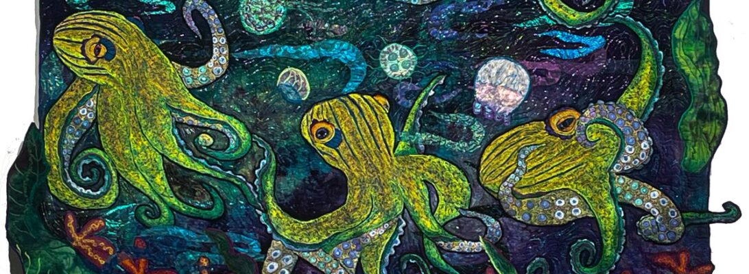
We worked with garnet stitch to do octopi several weeks ago. That was an all-over garnet stitch that could be shaded across the piece. But what if we want separate spots and smooth shading around them? How do we go about that?
What we need to do is to define the spot clearly, and then shade around it. But shading with one color around the spot negates a color range shade. We need to put in our spots and then shade around them defining different sides of the spot with different colors.
We start dark to light with the darkest threads first. The first color needs an outline stitch done at an angle to define the shape. Then we’ll shade out to the side, and then smooth the line between the outline and the shading.
But after that row, there’s more shading than outlining. When we come to each spot we outline the spot on that side and shade past the edges of it. Then in the next color row, we outline it from the other side and shade it into the earlier colors. The spot is clearly in the color range but it’s defined by the outline around it that fits the shading as it changes.
It’s a cool trick for including spots in a smooth range of colored stitchery.
We’ve been talking about the variability of the zigzag stitch in free motion. Most of the time, I’m filling in a space where I want a line of color to show up. This is a trick that will give me a soft blend of color across the image without a hard line. I’ve heard it called the long stitch, although the old-fashioned description you hear with free motioners is the long short stitch. As with all free-motion zigzag stitching, the difference isn’t a setting on the machine. It’s how you move your fabric through the machine as you’re stitching.
Most of the time when I’m filling a space, I stitch a zigzag line at an angle around the edge, I shade the piece by stitching from side to side, and then I smooth the edges with a zigzag that moves straight through.
But when you just move from side to side you get a long blending stitch that flows into itself. The breast of the bird is done from side to side. The feathers are done with an outline, shading, and smoothing. You can see the difference.