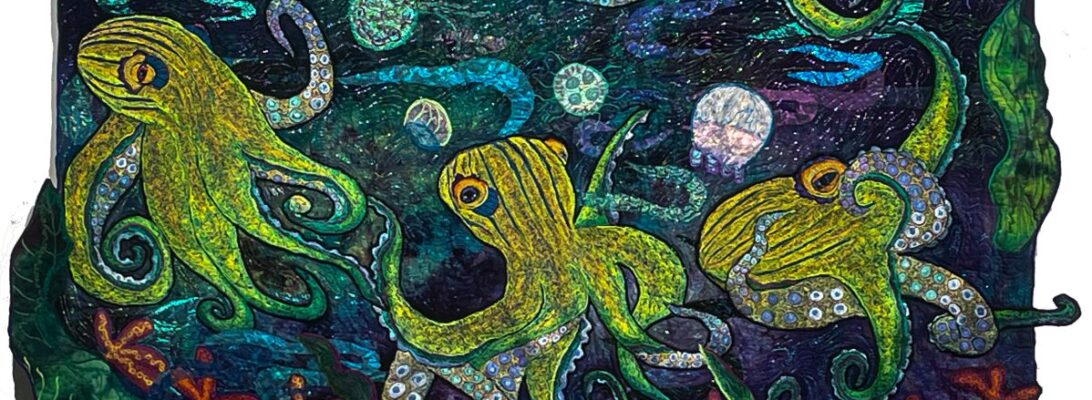
Hard Edge Applique: Redefining the Line

We talked earlier about soft edge applique. Soft edge is a minimal treatment that simply covers the edge of an applique with monofilament nylon or poly thread with a zigzag stitch. For things like water, air, fire, rocks, mist, suns and moons it’s perfect. Sometimes it’s good for flower petals as well. It’s for anything that doesn’t need a hard defining edge. It creates soft color shifts across the quilt.

But some things need that edge. Bugs, birds, frogs and fish all need that hard definition. Or you can’t really see them at a distance. And it makes a huge difference when you go to photo your piece.

You know I’m a color girl. I’m going to want to use color every time I can. But over the years I have learned, if you want it to stand out, use the black for an outline.

I particularly have tried it with bugs. Metallic thread green thread always gets my attention, and I reach for it much in the way you might reach for cherry cordial chocolates. But I’m mildly disappointed with it in the end, because it never gives as defined a space.

basic outline

I’ve been working on this egret, and the my process shots reminded me how important that outline is. Again, I’ve been working on doing a dimensional white bird, so it has a lot of contrast underneath to shade to white on the top.

The bare bones outline define the areas to shade with color. I’ve come to rely on 40 weight Madeira Poly neon. It comes in several blacks, but the definitive one is color #1800. I’m using a free motion zigzag stitch to outline, which is why the width is variable. (See post Zigging Upended for a tutorial on zigzag stitch).

I build color, from dark to light from the outline. For more information about choosing those colors, check out this post: Into White: The Search for White Thread Painting. But it’s coloring within the lines. As you can guess, I’m not so good at that. The threads encroach over the line and things get mushy. So the final act is that reoutline.

Redefining the outline

You can see the difference that second outline makes. All the edges that are fuzzed and mussy are now tightened up and out there.

The outside edges will be defined as I stitch the bird down. But having the inner edges cleaned with an extra edge of stitchery redefines all the lines.

finished egret

When I applique the bird on, again I’ll use my zigzag stitch with black thread. It gives the outline definition and punch and helps separate the bird from the background.

Studio Essentials: The Glory of the Design Board

1023-22 White Cherry Pond

Years ago I was in an Amish shop, where I made a purchase I really probably only could have made there. I bought 6 yards of black polyester double knit. The poor lady was scandalized. I was dressed in hand dye, obviously not only English but art quilting English. The Amish keep black polyester double knit for men’s suits. Clearly I was not making suits for some nice Amish man.

But it’s the perfect cover for a design board.

I have in the past hung things up on a balcony to the back porch and walked down the alley until I could see it right. That’s a bit hard on a daily basis, and I no longer have a balcony.

Do you need a design board? Yes. Yes you do. You need to really see what you’re piece is doing.

I have a lot of tools in my studio. I love my machines, my irons, my cutting and ironing table. But queen of them all is my design board.

I no longer work in bed quilt sizes. It’s irrelevant to art quilting. But most significant show quilts are largish. Average size for my work is about 36″ x 45″. It’s hard to find a flat surface that size that has nothing on it. Certainly not the floor. Never mind the other things that already on the floor.

The cutting table accommodates that size, but looking at something on a flat surface gives a distorted view. The only way you can really see your quilt is to hang it up.

There’s a rhythm to doing any kind of art, and once you start working makes you want to push through. It feels good to do that. But it’s a trap. If you don’t look at what you’re doing, it’s easy to do something you wish you hadn’t. Does it need to move over an inch? Is the drawing the way I want it? Are the colors working? If you can’t see it, you can’t evaluate what you’ve done. I can’t really see it on the table., either. The perspective is off when you see it lying flat. So up it goes on the wall. It’s worth leaving it there a day or two if you think something’s not right. You can’t see what’s wrong if you don’t look at it.

My wall a sheet of 4″ thick sheet of blue dow insulation snugged up against the longest wall in the sewing room. And it’s covered with that black double knit.

Blue Dow is available at most building stores like Loews and Menards. It comes 4′ by 8′. It is lightweight and you can pin projects up easily. It can be cut to shape with a bread knife.

Any large piece of fabric like a sheet, felt, or double knit can be used for a backdrop. Black, grey or white make good backgrounds. I like double knit because it doesn’t collect lint and the black is a nice dark black.

It’s also my photo wall. Having a photo wall and set up in your studio gives you consistent photos. If you have the same camera, the same lights and the same background, your photos fit better in with each other and are easier to adjust, since you know what to do for them.

I also usually take a picture of the days work as the last thing I do, so I can evaluate my next step. Usually I post it on Facebook if it’s interesting, but at least for myself, I can see what’s going on. And plan what to do next.

For more information about how to evaluate your piece and it’s progress check out The Importance of Backing Up and The Wrong Bird: The Importance of Not Settling.

For information about photo walls and lights, see Fiat Lux: Studio Illumination


Separation Anxiety: Making Mountains Out of Zigzag

The hardest technical thing to deal with in free motion embroidery is the distortion. Any time you stitch rhythmically and close together, the fabric will distort, trying to make room for the extra thread in it. More so if you’re using a zigzag stitch. Zigzag stitching pulls on both sides and can make a top wave like a flag.

There are several easy cures: Using a stabilizer, using a hoop, using smaller width stitches. All that being done you can still end up with a crumpled mess lying like a hat. It’s not a happy moment. It’s made worse by the fact that the fabric made by that kind of stitching is usually pretty fabulous. Just lumpy.

Can you steam it? You can try. Sometimes it helps. Can you cut it apart and put it back together? I’ve done it. It’s a last resort, but it’s better than lying in lumps.

Or you can cure it by cutting off the rumple. I’ve done that a lot with embroidered subjects. But can you do that with elements of the background? Why not!

Cheesecloth mountains

This is a direct applique technique. I have some cheesecloth mountains for this owl in the meadow. If I stitch them down on the quilt surface I will end up waving the flag. So instead, I’m going to glue them on felt and do my detail stitching before we attach it to the front.

Do I lose something by this? Several things. I lose the look of the hand dye behind the cheesecloth, which I like quite a bit. And I lose the distortion. I hate the distortion. Do the math and make your choice.

The felt I’m using is a cheap acrylic felt from Joann’s. It’s stable, doesn’t fray, and stitches well. I’m making my mountains out of cheesecloth and Steam a Seam 2. On the back, I have a layer of Stitch and Tear stabilizer to help control the distortion and give support to the stitching.

Cheesecloth is porous. The glue will come through when you iron it. I’m using a Teflon pressing cloth to protect my iron.

The glue will come through onto my pressing cloth. I can clean that off with a Scotch Brite No Stick Scrubby.

Once I’ve got it glued down and stabilized, I can start stitching.

The stitching on these is moved through the machine from side to side. That creates a long stitch that fills the mountains quite nicely. It also distorts the fabric a lot. You can see the pull of the stitch on the fabric as the stitching fills.

When it’s all cut away the distortion is gone and all is left is a thin margin of felt that can be covered with minimal zigzag stitching. All those textured mountains with two small rows of zigzag that should not distort much.

I’ll pull off the last of the glue before I apply the mountains to the piece. I use a small square of plain cotton (something I never want to see again) as a pressing cloth and iron the embroideries on high heat. The glue will bubble through to the pressing cloth and pull right off. Make sure you remove the pressing cloth while it’s all steamy hot. Throw the cotton pressing cloth away. It will transfer that other bit of glue on to another piece if you reuse it.

This is a hard edge applique technique, because when I stitch it down, the stitching will be a visible line of polyester zigzag stitching.

everything but the owl

Now all I need to do is stitch down the flowers, add the owl and stipple.

For more information about cheesecloth check out: The Miracle of Cheesecloth: It’s not Just for Turkey Anymore and

For more information about zigzag stitching: All About the Line: Choosing the Right Stitch

The Art of Unintended Consequences: How Can You Plan When You Can’t?

I love people who show me their quilt sketches. They have plans. They draw them out and then they execute them. It’s a great theory. I wish it worked for me.

It never has. I can plan all I want. Things shift and change under me, and the thing I’ve planned changes too. Quilt pieces shrink. Distort. Turn out to surprise me. All I can do is trim my sail to the wind.

I pieced up this split light source a couple of weeks ago. My hope was that it would go with my meadow owl. Unfortunately the owl was brown and the meadow was bluey green. That doesn’t sound bad but it just didn’t meld. They looked like two different quilts happening because they were.

The owl, with all of it’s purple shading ended up on a lovely purple/yellow backing.

The split light source piece lay folded up by the photo wall. And I looked up and found my left over koi.

These koi go back. They’re aged. I brought them with me when I came to Don from Porter almost 7 years ago. They were supposed to be a part of a koi pond that just never happened.

I’d tried several backgrounds, and they just weren’t easy to place. For one thing, they were red, white and black. That’s not my normal color scheme. I had a top started for them that was humongous. The whole thing left me quite overwhelmed. So they did what half finished pieces do in my studio. They traveled from the floor, to the photo wall, to the chair, to a suitcase, and back again to the photo wall. I don’t ever throw them out. You never know when their day will come.

Last Saturday was that day. I was trying out backgrounds for the owl. The pieced background did not make the cut for the owl. And there were those koi, hanging on the photo wall.

Splush! They fit right in. I made a batch of kelp. One of them was way too big, but the others slid around the fish in a lovely arch. Just add bubbles.

Could I have planned it?

Not a hope, not a prayer. But I’m thrilled.

Why do I think this happens? It could be part of my dyslexia. I’m not able to put things in order or sequence very well. But I have another theory. I think a piece of art has a life of it’s own. It’s more of a birth process than a conscious design exercise. I know pieces of mine have gone places I could not, done things I couldn’t have done. They have their own lives. They are not my children. But like children, they have their own path.

dimensional daisies: putting backgrounds into perspective

I’ve been working on this owl for some while. I have her soring over a meadow and I’ve wanted some wildflowers to make that happen. Daisies seem like a good way to start with this.

But how do I make the depth happen? I get that I make the daisies at the bottom larger and the ones in back smaller and less detailed. But how does that happen in proportion?

As a theory, I’m going to try to treat this as a prospective issue. There’s one point perspective and two point perspective. If I treat the daisies like I might telephone poles, can I get them to create a retreating background to the piece?

I’m not one hundred percent up on art perspective so I did a little research.

One point perspective creates a retreating road that goes into a horizon line. Everything comes into that one point on this grid. You can work it from any angle but it ends at the vanishing point.

Here’s the straight line, street version of this. It naturally creates a background that retreats.

Two point perspective places an object in three dimension in the center of the piece.

It naturally comes forward. It creates something that lands smack in the front.

That kind of perspective won’t give us a background. So we need to be thinking in terms of one point perspective.

I’ve been playing with several backgrounds for the owl. Not at all sure I’ve found the right one yet. Perhaps building my meadow will make it clearer which one I should be using.

Here’s a plan for daisy perspective. The slanted line horizon line is the body of the owl.

This background worked a lot better with the daisies and the owl. It picked up the purple shadows in the feathers and sets off the yellow flowers. I did a huge pile of daises, in gradated sizes.

The larger daisies at the bottom gradate smaller until they reach the mountains. It’s daisies used as telephone poles.

What happened to the gradated piece? That’s another story. But it’s already got a home.

Over and under: three dimensional leaves

The leaf is all one piece of fabric. The threadwork defines the fold.

If you’re making nature quilts, you’re likely to need to answer the leaf question. Leaves ripple and rumple and almost never lie flat. And they fold. How do we make that happen on the quilt surface?

Here some approaches.

defined by stitch

I tend to use a free motion zigzag stitch mostly to apply leaves. It’s fluid. It follows curves. And I can change color at will. I also tend to use a polyester Neon embroidery thread by Madeira. It’s strong, bright as a button and light enough to stitch over several times until I get what I want.

Dividing a leaf in half and coloring it with one side dark and the other light creates an immediate sense of dimension for this quilt. It’s the same fabric, but the coloration changes with the thread choices.

defined by applique method

Direct applique is applied right to the top of the piece with glue. I use Steam-A-Seam 2 by preference because it allows me to move the piece around before I iron it into a permanent place.

This makes simple shapes easily. But it doesn’t allow for wild curves and vines

The leaves are drawn on a separate fabric and stitched to the top. Then the access is all trimmed away.

cutaway leaves

Cut-away applique is done with a cloth laid over the top and stitched in the shape you want. Then the leaves, vines and trees can be cut away along the stitch line, leaving more fluid shapes.

Leaves formed by cut-away applique continue the background shading through peek-a-boo holes.

Cheesecloth leaves

The sheer qualities of cheesecloth and the texture mimics the cell structure of the leaves and lets bits of the background through. Cheesecloth makes fabulous leaves and can be dyed any color with Procion dyes. The wild stitching with lime and orange makes them look crinkled.

Making the leaf fold

This cheesecloth leaf folds along the darker blue line of thread. The threadwork itself defines the fold. The purple line on these leaves folds the center and the two slightly different thread colors top and bottom help confirm that.

Mostly leaves are defined by threadwork. These are some ways to make leaves look like they popped out of the background. And that’s pretty much what you want.

Splitting the sky: The Advantage of Split Light Sources

I don’t piece well. It’s not my skill. Anything that takes accuracy and careful cutting really isn’t my skill. The new 770 Bernina came with a foot that does make it better, but I don’t normally do large pieced tops. I know better. It’s not pretty when I do.

But there are rare occasions when I piece a split light source top.

Why? Why walk into accuracy land and piecing?

A light source brings you fabric with direction, and a built-in world. That world can be integral by itself. But if you want to filter the light as if it were through haze, woods, or shadow, you can piece two light source fabrics to create that shaded look. There are several approaches, with different effects.

Vertical Piecing

Where the Heart is

Where the Heart Is was pieced from two separate yards of the same blue/orange color range. I lay both pieces together on the cutting board and cut them in gradated strips, 2″, 3″, 4″, etc. Then I sewed them together with the narrowest light of one to the widest side of the other, in gradation. Set in a vertical arrangement, it makes for light flowing through the trees.

Horizontal Piecing with a Frame

Envy

Envy was one horizontal light source yard, split in gradations with a half yard cut in 2″ strips put between. The piecing creates a sense of space. The narrowest strip in the gradation defines the horizon line.

Piecing within Multiple Frames

Sometimes I split the two fabrics with the light at the widest on one side and the dark widest cut so they can carry the light across the piece. Twightlight Time was also double framed with a 2″ and a progressive border. Having a narrower border on the top weights the bottom of the piece.

Piecing Machines

Lately, Don found me a Singer 99 at a yard sale. For those of you not familiar with these darlings, they are a featherweight industrial drop-in bobbin Singer. They only straight stitch, but the stitch is impeccable. They are tougher, and faster and they use bobbins that are still commercially available. I’d never seen one before, but I fell in love instantly. It took a little work and some creative parts searching, but Don got it working for me and it’s perhaps the best piecing machine I’ve ever had. Did I mention Don is my hero?

So I pieced the guinea hen’s background on it.

How do you keep it straight? It’s tricky. If I get them out of order the fabric doesn’t progress correctly through its colors. I make all my cuts, leave the fabric on the cutting board until I can number the pieces all on the back side. Since there are two pieces of fabric cut, I label my fabric, 1a,2a, etc. and 1b, 2b, etc. and chalk in the sequence on the ends so I can always keep them in order.

Expanding Fabric Size

Sometimes there’s just a beautiful fabric that needs to be bigger. That’s been known to happen too.

I needed a background for What the Flock, a grouping of guinea hens. I’m low on fabric and money right now, so I have to make do. I found a purple piece that should make a great meadow, but a yard was just a bit small. So I pieced in another half-yard to expand it. I cut the half yard in 2.5″ widths and graded the yard-long piece in segments of 9″, 8″, 7″, 6″, and 5″,

Seam Rollers

For those of you like me, who hate to run back and forth to the iron, there is a seam roller. You can use this gadget to flatten your seams right where you’re sewing. Roll it over the seam and you’ll have flat, ready-to-sew seams without the iron woman run.


I don’t piece often, but these backgrounds are worth it. I love the shaded light and the action of light of the fabric across the piece.


FENCED IN: Making Fences

Most artists have something they do specially. The secret to that is that special focus usually camouflages that which they are not good at. I’m no different. I can’t sew a straight line to save myself. So I don’t. I do nature images where straight lines aren’t a problem. I don’t do well on straight line piecing either.

Except that that is a limit. And I hate limits. So every so often I push past that and try no matter how bad I am at it.

I’ve been working on a garden series called bird feeders. The premise is that every good garden feeds and cares for everything that lives within that garden. And some things just don’t grow without support. Which means a fence. Of course I’m not talking about clean new straight fences. What fun is that?

I’m not good at fences. You should be able to piece a good fence. But I’m really not good at piecing. These are three things I’ve tried instead of that.

Years ago, I did a child’s book called Tigrey Leads the Parade. It was about my dog who ran away daily as an art form. Since it involved escaping from the yard, it involved a lot of fences. This is a fence, embroidered with #5 pearl cotton on a tea towel.

Tigrey Leads the Parade

I love these stitched fences. But they were tiny. When I wanted something bigger, I tried something with an oil paint stick rubbing. I found a border edging at Menards and rubbed the fence texture on to my background fabric.

Bird Feeder: Sunflower

I consider this a mixed success. I like the fact that the fence looks crooked and old. But the distortion, even with straight stitching and stabilizer was pretty ferocious. Were I to do it again, I’d use another layer of Stitch and Tear.

So when I went to do the next piece I had some left over gray pieces I’d used as sidewalk. I used them to make the fence. The wood grain stipple helps it, I think,

They didn’t quite work as realistically, but I think they made a good fence. And good fences, as Mr. Frost knows makes good neighbors. And better quilts.

Do I have it down yet? I don’t think so, but I think I’m closer. If we don’t push past our limits, the limits are real. No one wants that, right?

Fade to Black: Shading black objects for dimension

Envy

Black and white have the same problems. They’re absolute colors that are really harsh statements in their full form. I almost never do a completely black or white object because they are so overwhelmingly strong and so flat. They overwhelm instead of fitting in.

I’ve worked on creating a white dimensional bird out of different pastels and greys. You can see the result on this post, Into White.

But would the same approach work with black? Instead of using tinted pale colors to create depth, use toned darker colors to create shades of black and greys? That’s what I’m going to try. I’ll take step by step photos so you can see if it works.

Indigo Blues

Have I ever done this one this before? Sort of. I’ve done black before, but when it comes to the contrast shades I’ve turned to purple and blues all of which because they were in my stash were a bit bright. The effect was essentially a purple and blue bird. It’s a fun art statement, but it wasn’t what I was aiming for. I really did want black.

I found this great drawing of a raven I did years ago. It fits into my birdfeeder series, so we’ll see what we get.

This turned out to be hard. I ordered the darkest threads in blue, grey, brown, and purple for it. When they arrived they did look ugly.

The other hard thing was telling which were darker. The tones were very close. I used my red, and green color filters and did the best I could to arrange them dark to light.

The real question is, is this a brown/black raven or a blue/black raven? I’ve tried to mix both blues and browns for a neutral black.

It’s not uncommon for this process for the stitching to be discouraging. It doesn’t look really impressive half way through. So I’ve taken step by step photos so you can see the change.

It didn’t work the way I expected. I was quite disappointed. Then I did what I had planned in the beginning. I used black metallic as my last color. The last color is always your strongest color and the one you will see the most.

The final thing that helps this out is the background. I’m using this piece of hand dye that pulls towards the brown/grey shades even with the yellow reds in it. The color of your fabric is the light source of your piece. This background echoes the brown/blue/black quality of the bird.

Is this a final answer? It is for this piece. I want to play more with it after I’ve had a color fix working on something bright and showy. All these neutral darks are depressing, but I think I got my bird where he should be. I think he needs to be flying over conifers. Maybe I do too.