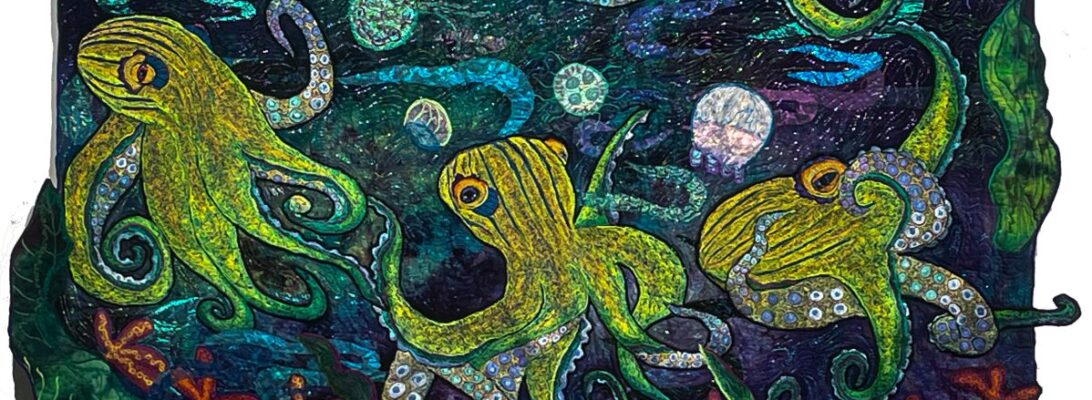
Have you Heard This One? What happens if you add Water to a Matisse?

I get caught in themes. I get excited by birds or fish or bugs, which I do for a while. That’s fun, and it lets me explore different stitchery. But every so often, something new lures me elsewhere.

I’ve been mesmerized by octopui lately. About their wonderful movements and their textures. I’ve been reading a book called Remarkably Bright Creatures, by Shelby Van Pelt. It’s a delightful tale largely of an octopus and a cleaning lady.

I’ve lived almost all of my life with my creatures as my closest companions. Can an octopus and a 70-year-old lady be friends? I’m jealous. I’d love an octopus as a friend.

And Matisse. How do octopi and Matisse mix together?

Matisse did a lot of work that centered on movent and patterns. I deeply love his paintings for their rhythms and movements. Can you see how this starts to mix together? The alien grace of an octopus reminds me of these ladies in their dance.

I’ve always loved these dancers. Now imagine them as octopi. I know. It’s kind of an art joke. But I’ve been wanting to do this for months.

These are the octopus I have planned for the quilt. I think they should all join tentacles and dance. Again, it’s about movement together.

Both the quilt and the painting are about fluid motion, the dance between us as a group. So that must be what I’m working on. I rarely understand a piece until it’s finished, sometimes much after that.

Why do art jokes? Because they make us think differently. And that is largely what art is for. And things need to lighten up a bit right now.

I’ll be showing you more of these octopi as I go along. Next week we’ll talk about garnet stitch zigzag and straight and how to shade with it. Right now I’ve been doing sucker.

Tune in next week for tentacles!

telling the Story: How backgrounds Change Everything

Today I needed a color break. I’ve been frantically finishing the Stitch Vocabulary Book for three weeks, and I was terribly tired of computer work. So I sorted out the fabric I intend to bring to sale at Gems of the Prairie in May, That meant I set aside the pieces I wanted to work up.

Of course, that was an immense pile, Somewhere in it, I found this owl.

He really wasn’t lost. I knew he was around. I just wasn’t sure what pile. He was the third of three owls I made for a quilt that simply never worked.

I found several pieces that I thought would be amazing backgrounds. But a very strange thing happened. It wasn’t just that the fabric made the owl feel different. They actually started telling really different stories about him.

So this had a golden open door he’s going through.

Investigating a flower in the garden. Perhaps with small mice or butterflies.

Flying toward a red moon. Or is it a rose?

Is that a fire or a sunset? Is he flying towards it or in flight away from it?

Or somehow a moonlit winter night. Perhaps with snow. Or a flowering tree with moths?

I’m always astonished by hand-dyed fabric. It’s so versatile and offers so much to design. But I hadn’t seen it as a backdrop to a story. And that’s exactly what it did.

Which will I choose? I’m not sure yet. Normally I’m drawn to color. But there’s something fabulous about that winter moon. And while I work on it, perhaps it will tell me its story.

In Black and White: Using Black and White Photography as a Design Tool

I have a secret design tool. You probably have it too. In your pocket. Yes! It’s your camera phone.

We’ve most of us succumbed to using our cell phones as our cameras. It’s one less thing to stuff in my bra, since most of my clothes lack pockets.

One of the hardest things to evaluate in your art is value. Value is the darks and lights in a piece. Color is like candy. Or antidepressants. You reach for them because it feels great.

But value is so much harder. And vital. Texture and color shine out. But value separates the different components in your piece. The best way is to see it in black and white.

I haven’t mussed much with black and white photography since you had to give black and white pictures to newspapers. I’m really dated by now.

But a black and white image will show how the values are playing in your quilt. And will help show you how your design is moving. Your eye will follow a path made by the brightest object. If you make those objects into a path through the piece, you have a visual path that will showcase your work best.

And current cell phones make it simple. There’s a preset in your camera program that will give you a black-and-white photo.

I used this technique when my friend Sharon asked for some design help on her quilt. You’ll find it at A Visit to the Studio: Dsignng with Another Pair of Eyes,

Every design has a path through it. It can be clear and obvious. But what if it isn’t? And how can you tell?

The black and white photos tell us everything we need to know.

This is the beginning picture with the fish with reeds. This didn’t quite move the way I wanted it to. The reeds didn’t form a clear enough path.

Here we see the placement for the smaller fish. But you’ll also find the placement of the reeds moves things better.

Here’s the final picture with bubbles. The eye travels through the piece with grace.

I always encourage you to take pictures of your piece as you work on it. It’s great to have documentation about your work. But it’s also a great design tool.

The next time you’re unsure about the design of a piece, take out your phone, take a picture, and see it in black and white. It will tell you all you need to know.

Turning Over a New Leaf

We’ve talked about ways to make leaves more real. Leaves are wonderful shapes in themselves, but because they bend and fold and move, they add movement to your piece.

I’ve been working on a fish quilt that I wanted to frame roughly in kelp leaves, and it seemed like a good study on making leaves fold. Kelp is a water plant that bends completely to the movement of the water. But it has a definite back and front. We’re going to experiment with making the leaves fold for this quilt. Here we have just raw cut leaves.

I can see some purples in this as shadows, perhaps, but what I really want my thread color to do is to define the front and the back of the leaves. I intend to stitch the edges pretty heavily, so I’m going to do the leaves separately. I’ve cut leaves freehand from several scraps of green and glued them to felt with Steak a Seam 2. On the back, I have Stitch and Tear which is a crisp tear-away non-woven interfacing. So my embroidery sandwich is my hand dye, Steam a Seam 2, and Stitch and Tear.

I took a piece of the release paper from the Steam a Seam 2 leaf cuts and have folded it in different ways so you can see how that affects the leaf. The front side edges will have heavy crenellation on them. The back sides will be smooth where the folds are.

My thread zones are back and front sides. The front needs to be bright/dark /intense colors. The back needs to be muddy, greyed, soft colors.

It seems like the fabric should define the leaves completely, but I’ve found that’s never really so. What defines much of the leaf color is the thread. If the thread is purple it’s at least a purplish leaf. Sometimes that’s the way to go.

stitching the leaves

Here’s a video showing the crenelated stitched edges.

The leaves fold in the water. On the front side, their edges are crinkled and bright. The edges on the back sides are smooth and greyed out. once they’re applied to the quilt I can take sheers and lace and overlay them with water so they look wet.

Here are some of my separate leaves, made to fold in the water.

I’m not so sure about this layout. I think I need to leave it on the wall for a while and see if I have the placement right. I may have overdone. But since nothing is stitched down, nothing is written in stone. I’ll see how it looks in the morning.

To explore more ways to make leaves check out my previous blog post, Over and Under

Tip ME

I’m a bit shy about this, but all art runs not only on desire or passion solely. There are bills to pay and we hope all of us as artists to sell enough work to pay them.

But those of us who have taught, who have shown, who have written to share their art know that much of what we do is never paid for, except in the sense that we pay back the people who came before us. It’s how we make a community for all the artists we know.

So if you would like to support me, buy me a cup of coffee, or let me know I’ve helped or inspired you in some way, here’s a tip jar. I know you’ve supported me all along my journey as an artist. If you’d like to express that in a monetary way, I’d be much obliged. Thanks!

Tip me

Flamingo Legs and Other Troubles: Designing for Smaller Images

Free motion stitching is versatile. One of the graces of working free motion is the effects you can get with the stitching, just out of the angle your fabric goes through the machine. It’s about filling in space.

I’ve been asked by someone to do a flamingo quilt. I’d been hesitant in general to quilt flamingos because they’re a signature piece for Ann Fahl who won at Paducah with an astonishing work called Flamingo Garden. I haven’t wanted to step on her turf. I hope she won’t see my working on a flamingo in that way

But as soon as I started to look at flamingos, I was hooked. The colors are eye-popping, after all those properly grey birds and they are outright silly. I’m in love.

So I drew up three flamingos bathing. These are much smaller birds. They’re around 18 inches as opposed to 40″. Their impact is different and the coloration on them has to be different. It makes sense. If you’re filling in less space you have to cut out some of what you’ve used to fill in a larger space.

There are several ways to do that. One is to use fewer colors. When I choose colors, I choose the darkest of the base color, then a shader color, a range of the base color dark to light, a shocker, and then the lightest of the base color. That range can be massive. It’s not at all uncommon for me to use 60 colors in an image. But for these little birds, it has to be less. I ended up using about 20 colors

The other way to expand the space is to use a smaller zigzag.

Finally, I used a straight stitch instead of a zigzag stitch for the detail overlayer.

Every piece is different: in size, in coloration, in stitchery. But I’m pleased with these little birds.

Breaking Through Borders: Establishing Movement through Frames

Being someone who does nature quilts, it seems unnatural to frame a background with a border. Nature doesn’t fit into a picture frame very well. Of course, there are times when you simply have to. You have a 50″ subject that needs a background and 45″ fabric just won’t stretch far enough to accommodate.

But there are other reasons to create a border.A border can emphasize a light source in the center. A border can bind your subject into the frame of the piece, capturing it almost. Breaking through that border establishes the idea that your subject can’t be contained. That it’s moving so hard and so fast you can’t keep it in a box.

This heron just turned out to be too big for any of the fabric I had. I considered splitting a light source, but the background was just too good to cut up. So instead, I bordered it.

Borders are basically a frame. And like other frames they either offer something special or they really detract. You can use a border to create a different atmosphere, to give a boundary, or to simply expand the fabric. In this case, I needed the fabric extended, but I didn’t want to make it a square box for my subject.

These rectangles show three options: an unbordered piece, a piece with equal borders, and a piece with gradated sizes. Equal borders make a plain frame for the subject. But a gradated border gives weight to the bottom, gives a travel direction to the eye, and starts the movement of the piece before the subject is even applied.

I cut my outside strips at 5″, 6″, 7″ and 8. Narrowest on the top. Widest on the bottom. The green inner border is almost the same value (black/white) as the purple so it doesn’t make as hard a border statement.

The head of the bird is in the lightest (narrowest) spot and his feet are where the sun don’t shine.

The frame also creates a light source in the center, illuminating the bird.

Using a border, not only to make more space, but to define light and direction is an easy way to make a frame. And pulling your imagery out side the box breaks the border in a way that makes the whole piece move. What could be easier?

Year’s End

What can you do with your days, but work and hope. Let your work find your dreams through your play. What can you do with each moment of your life, but love till you love it away.

Bob Franke, Thanksgving Eve

It’s the end of the year. I don’t always pay much attention to that. Every day is a studio day, and everything else is pretty much second to that.

Three years ago, I thought I was done. I thought I wouldn’t go back to my art. I had lost so much and I didn’t see a way back.

Then three things happened. I sold a major quilt I never expected to sell. It was big, it was odd and although I loved it, I knew it wasn’t within the mainstream. But it sold.

I told Don, and he turned to me and said.” Do you want a studio?” “I have a room,” I said. “No. A studio. He gave me his old house as a studio. And because we’d sold the quilt, there was enough to make it into a studio.

That changed everything. Between that sale and a place to work, God, or the universe, or just two people told me that it was not over and I should go back to work. And that they believed in me. I have no words. Thank you is inadequate.

Art is about finding beauty, finding sense, finding ourselves. It’s about retelling our stories. Sometimes your life is your art. You pour yourself into what you’re making. Sometimes your art is about finding ways to make your life beautiful and more sensible. Functional. It isn’t that some of us are artists. That’s for all of us. It’s our birthright as human beings that we are many things: a drummer, a potter, a writer, a musicial, a mother, a gardener, and among all of those, an artist. As we live we switch through seasons of doing art and living our lives as an act of art. It really is genetically who we are. Our art defines us and redefines us, but essentially, it retells our stories until they make sense to us.

So here is the bulk of my work for this year:

In all, it’s a year when I made over 200 square feet of quilts. I had a show at the Cove Center in Havana, Il. And I showed off my work at Feed Mill Fabric and Quilts, and at the GAlesburg Art Center. And I could. Why?

Because of the support I got from you all. When you follow my process, share your own journey, purchase a quilt or fabric, let me show, you aren’t just interacting with me. You’re impacting what I can do in the future. You are making resources available that make my art possible. Again, thank you is inadequate

Small Artifact Quilts

For that, in return, I try to give you back my art, my process, my knowledge, and my love. It’s small, but it’s what I have. And it’s mine, only because you’ve given me yours.

To Don, words are completely inadequate. But I’ll make you fried mushrooms tonight. It’s a sign and a symbol. And it’s art into life.

Tiny: How Big Does a Quilt HAve to Be?

I’ve lately been working with some larger major works. This year has been about building back a body of work. And it’s been successful. Here are a few of the larger competition/gallery pieces I did this year.

These pieces excite me. They take a real chunk of time, but I’ve learned some technique this year that has speeded that up. But a large piece is about a lot of visual thought. It has to fill up space so it needs points of interest, both up close and at a distance. The longest part of a large quilt is taking the time to think it through. They don’t work like small quilts. I know people who enlarge a small design into a large quilt. I’m not one of them. The space gets filled differently. Larger quilts are made from a central object with paths drawn around them.

Smaller quilts are more like snapshots. Not much there. But it’s all good eye candy. I spent the last couple days pressing through some little artifact quilts (made with rubbings and found objects). Because they are so tiny they offer a lot of freedom.

Lately, I’ve been working smaller as well as bigger. There is something wonderful about a tiny world you can step into visually, as a private retreat. They are designed differently so they make your brain think differently. And because they’re small they’re affordable. Everyone deserves art.

Besides, tiny quilts can go in intimate small places. They don’t need a full wall. They don’t have to match the couch. They make a retreat into another world in just a tiny space.

This is the latest batch of tiny quilts. You’ll find them on sale in my Etsy Shop.