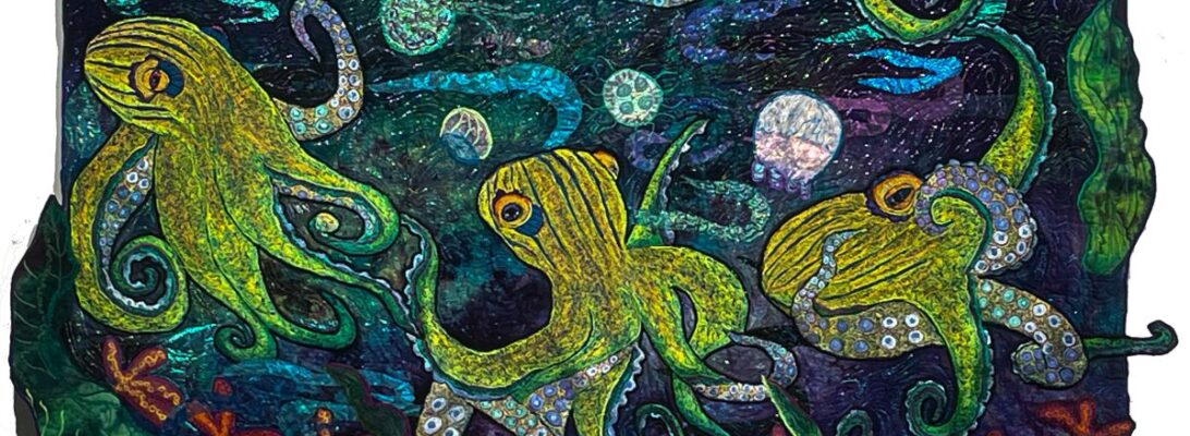
We’ve talked a lot about shading. I’m fascinated with making animals that are dimensional, and shading is how we achieve that. Shading is about delineating light from dark. But it can be a rough moment when you start to shade. It can feel really overdramatic.
I was working on this goldfish for a quilt called Fishy Business and I was struck with how very shocking it could be to stitch in with the complementary color all over your image. Every time I do it I take a deep breath and tell myself I haven’t ruined it.


The last color you put on is your lasting impression. Everything else just peaks through. But those sneak peeks are so exciting that they make it all work. Your eye blends the colors so that they stay fresh and don’t brown each other out.
I remember in class once insisting that a woman making an orange/brown squirrel needed to put blue in her stitching. She was appalled. And I understand why. But it all sorts itself out after you come back in with your primary color. It also gives you color under the skin, just like blue veins color our peachy selves.
So here’s to the courage to add the color that really seems like it might be too much. Undershading builds the dimensionality and tone. It creates unbelievable color.


